guide
GAMUT is important to consider when handling graphics. Color gamut is the range of colors available in a color space as compared to the full visual spectrum. Notice how the CMYK color space falls inside of the RGB color space. A general rule of thumb is to work in RGB and convert down to CMYK when your piece is going to print; but if you know where your piece will go, why not design it in the correct color space to save time?
RGB
Raster Illustrations
Photographs
Screen Graphics
HEX
Web Color Schemes
CSS
CMYK
Brochures
Postcards
Any print collateral
PANTONE
Company branding
Logo Design
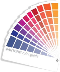
PANTONE Since there are numerous variables in printing such as ink strength, halftone patterns and paper absorbtion, it is challenging to ensure that what you see on your screen will match what is printed. When absolute printing accuracy is needed, as with product design, Pantone (aka spot) colors are needed. Spot colors are specific premixed inks which are selected using the Pantone color catelogue based off of the print media. For example, if you are designing a cotton textile pattern, you would select your colors for the design using the Pantone Cotton catalogue.

For obtaining the best possible match with commercial printers, you can select your colors using the Pantone Process color catalogues. For example, if you were designing a brochure that was going to be printed on glossy paper, you would select colors using the Pantone Process Coated color catalogue. It is important to decide which stock your piece will be printed on before selecting colors. It is often helpful to consult with the printer's customer service department to determine the best catalogue to use for the piece. Keep in mind that spot colors cost more than full 4 color process printing. Factor it into your project budget.
